Wednesday, July 20, 2011

Manga Paper


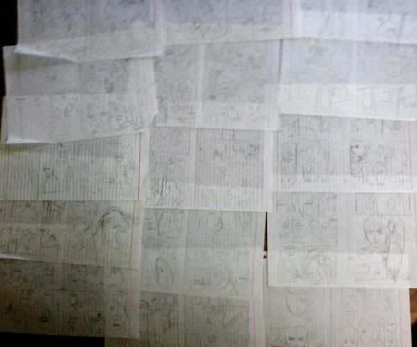
I finally stocked up on manga paper from Kinokuniya - I was down to my last 4 sheets! I use the I-C Inc brand. It is a lovely thick cream paper with the ruler and margins in pale blue. (This blue apparently doesn't copy in photocopies, and pretty much disappears when scanned once I do the balance correction.)

I like to draw within the margin, but I do know the others in Kiseki tend to draw all the way to the edge of the page. In my opinion, that's a very digital-era look and it does look very nice and flashy.

However the manga I grew up reading was more traditional so thats what I want to continue and learn how to use.

I believe you can convey different feelings with panelling. If you spread the panel beyond the margin to the edge of the page, it can feel open like a panorama. That's why introductory shots of buildings and landscapes tend to have this kind of panel. The increase in size also helps give importance and a sense of time and space to the scene. I also like the feeling of borders, with the negative space helping to push the panel out at the viewer. (However, I also go right to the edge when I'm running low on space!)

Alternatively, smaller panels have tighter/faster pacing and/or are less important visually. It doesnt mean they are not important to the story, but you are usually not trying to call the readers attention to something within the panel. Note usually! What comes to mind would be many small panels where it's various stages of a complicated action, like someone cheating at cards or a really impressive sports move in slow-motion.
I'd love to talk more about what I think about panelling, but this is more a post on paper!

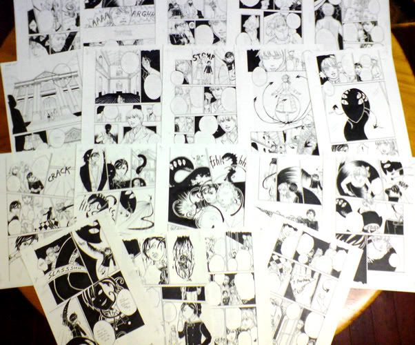
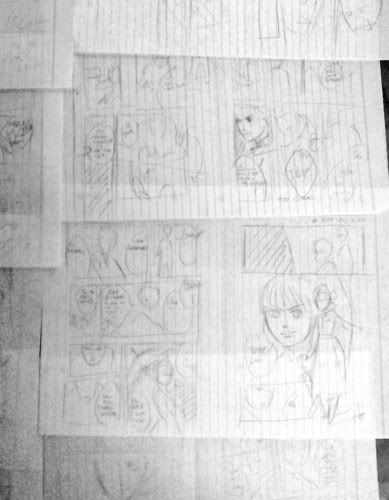
Here is a sample from TMoTW chapter 2:

Click to enlarge

The red box is the margin, where I try and put most of the information. The green box is the edge of the page - beyond that is the bleed. You should draw beyond the bleed, because you never know if the printer is gonna cut right on the line of the edge. You have to leave a margin of error, otherwise they could cut it wrong. If they cut it too far beyond, you could have an unsightly white space where you didn't draw. If they cut it too far in, you may lose information, so you must be careful not to have anything too important at the edge of the page. As you can see, my speech bubble is too close! Kiseki requires a 3mm bleed.

Here is a sample page from the I-C Inc paper. They have an explanation sheet included with each pack of paper - in Japanese! My additions are in orange and are not a translation, but instead how I use the guides on the paper.

Click to enlarge

It's really nice and easy if you're drawing traditionally to use this paper, so you are 100% sure where the bleed and margins are.


Want to learn more about manga paper and panelling?

Manga tutorials - manga paper
A more thorough explanation of how to use manga paper, as well as downloadable sheets you can print out.

An interesting tutorial on panelling by an OEL manga artist:
Paneling, Pacing, and Layout in Comics and Manga #1

Will Eisner - Comics and Sequential art
He has a beautiful use of the whole page and sometimes instead of boxes for the panels, he uses the negative space or framing the shot within images, e.g. having the figure framed through a doorway. It really gives a fluid look to the whole page. I really recommend this book - Eisner is one of the greats of comic storytelling. Although I suppose if you wanted to purely focus on manga, you could give this a skip - however, I think the mark of an artist is research to broaden their horizons!

I have not read a manga specific panelling book, but if you have any reccomendations I'd love to try and check em out! After all, I'm still learning and very keen to learn more!

Sunday, July 17, 2011

SMASH 2011

This year Verric was at SMASH convention to help out with the Kiseki table! We had a lot of fun and we sold out on the day! (Don't worry, more issues are available online + more at Animania - including Issue 8 with tmotw ch2!)

We had a small freebie for those who bought Kiseki - tmotw bookmarks that Verric made! Here are some sketches made in developing it:


The original cameo sketch, which was inked digitally:

Meanwhile, Verric began plans...

A page from Verric's sketchbook. Verric began to put it all together on the computer, adding some traditionally made splatters and making some changes.
Photobucket < > < >
And then production started! Printing, cutting and rounding the corners:

Done! Huzzah!


To everyone we met at SMASH: thank you for your support and we hope you enjoy our work! We are working on our next couple of chapters and hopefully have some cooler goodies planned for Animania! See you there!

Tuesday, June 21, 2011

Oops!

Verric speaking here!

I decided to try out digital colouring. I made the sketches at work, trying to figure out which was the best way. I needed it to be read Right to Left as it is a TMOTW work. To my eyes, it worked in the sketch because it was greyscale, but once I did the prelimary colours it is now Left to Right! Oops! My latest version is at the bottom but I'm not sure I have the heart to continue working on it right now. Perhaps closer to the deadline.

It shows I have a lot to learn about the use of dark/light and colours.


Photobucket resized this really small, which is probably for the best.

Monday, May 16, 2011

sketch for BBG

Here is a sketch for the picture in the previous post.


I've been doing my pencils by hand and then redrawing it digitally and here is a clear example of this. As you can see they are very similar. Drawing digitally really allows me to get symmetry right and avoid hours fussing around with a ruler. I haven't quite figured out symmetry when drawing by hand!

Big Bad Guy

Scribble Asylum have been keeping busy! While working hard at our day jobs and tMoTW, we found the time to make a oneshot story called "Big Bad Guy". We can't say much about what's happening to it now, but when we get news, you get news!

Verric
This oneshot was the first thing I did in digital, and I had to draw everything first by hand and then trace it using the tablet. It isn't much faster than doing it all by hand sadly! Well, I can only hope to get better.
This picture is one of the drafts for the title page:


Evi
It was so much fun working on 'Big Bad Guy' - it started as an 'one paragraph' idea which I'd scribbled down on the train to work. However, the idea then took a life of its own and wouldn't let go - by the end of the day I had a full story.

The one-shot was a welcome distraction from tMoTW. I'm really happy because this is the first time I have written a purely humour based script and found that 'Big Bad Guy' was the perfect framework to slot in all the insane ideas Verric and I have when we're chatting. BWAHAHA.

I'm so happy to make it a finished product. Hopefully in the future we can expand it into something bigger so we can share the love that we have of the characters. :D ( The oneshot is only the beginning - I have many many plans for my darling characters...)

Sunday, May 15, 2011

tMoTW chapter 2 update

Here's a preview of chapter 2, with the physical inked pages spread over my dining room table. It's kind of awesome seeing them like this - it's one way to appreciate the work that went into the pages. I like to think I used a lot more black for this chapter ;)

placemats


We finished this some time ago, and hoping we will see it in print soon!

Wednesday, April 27, 2011

The Making of tMoTW ch 01

Verric speaking here!

Today I'm going to talk about the arduous process we use in making our manga. We probably spend too much time on each chapter. We get about 2-3 months per chapter, but we also have busy lives outside of creating The Misadventures of Tripp Weston. I like to think we're beginning to streamline this process!

Firstly, Evi will write the script. That's a hard job and I don't envy her. This gets sent to me and printed out - about 10-15 pages of written dialogue and descriptions. We go over it and make changes and begin discussing what we want it to look like. Evi will often do many copies, but I tend to only print out the final and write in any changes needed. My copy begins to look really dog eared and scribbly!

After this, I will begin what I call "storyboarding". It's not storyboarding in the true sense of the word, because that word is used in animation. Others would call them thumbail sketches, layout roughs, or the dummy. I begin to seperate the script into pages and quickly drawing out the layout and characters. Because Kiseki is published in asian format (reading right to left), it gives precedence to the left hand page. So I try pace it so that really important action falls on the left hand page. It's not always possible. I always have to keep in mind where the spine falls - you don't want to have something important like a character's face or a speech bubble too close to the spine.

Here are the stroyboards for chapter one:


and a closeup:


As you can see it's drawn very quickly! I just work on lined paper folded in half, so I can fit 2 pages to a sheet. This helps remind me where the spine goes when I'm drawing. Sometimes if I want to spend less time on the storyboards, I will fit 4 pages to a sheet.

This gets shown to Evi and we go through it. We've discovered because I letter the dialogue so roughly, this impedes her understanding the roughs, so these days I scan the roughs and digitally put in the dialogue. But we hadn't discovered this for chapter one. Anyway, once I get her approval, I redraw them as pencils on the correct paper - I'm using I-C Inc. manga paper because I'm too lazy to rule the page lines myself. Because I tend to make changes again here in the pencils, I run it by Evi again. Once all changes are made, I begin the inks.


Photobucket

Here are all the inked pages. Pages 1, 2, 3 were intended for colour so were not "blacked". I don't use screentone, but instead lots of flat black and some hatching. I had a lot of trouble making them presentable for publishing by Kiseki. Because they were drawn traditionally, when zoomed in the lines appeared very rough. So thats why you can tell it's quite smoothed when you view them in the magazine. By now, if changes are needed I say "tough luck!" ^^" By the time I've reached digital editing the inks, I'm always too close to the deadline.

There you have it, the story of a very lazy artist!