Showing posts with label WIP. Show all posts

Friday, December 9, 2011

Mystery future setting

Verric

A future setting for quite a few chapters ahead.


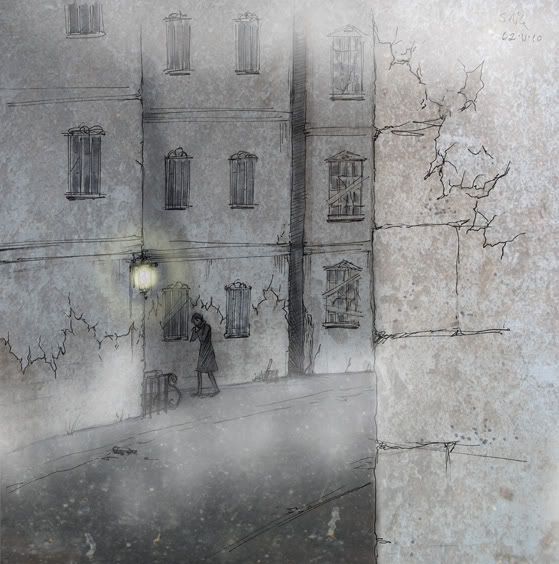
It's kind of an underground setting, which is accessed through this shady looking alleyway. The interior is still being designed. The exterior design already changed since I made this image too, which made me a little sad that it became redundant so quickly.

I'll be posting up some more sketches for future settings soon! We will be having an art deco inspired building coming up which I am really excited about drawing.

Some heads up - there may be some hiatus issues, but Evi and I will be trying our best to continue our chapters and instead posting them on smackjeeves or a similar comic hosting site. When they're up, I will be sure to link them.

Tuesday, June 21, 2011

Oops!

Verric speaking here!

I decided to try out digital colouring. I made the sketches at work, trying to figure out which was the best way. I needed it to be read Right to Left as it is a TMOTW work. To my eyes, it worked in the sketch because it was greyscale, but once I did the prelimary colours it is now Left to Right! Oops! My latest version is at the bottom but I'm not sure I have the heart to continue working on it right now. Perhaps closer to the deadline.

It shows I have a lot to learn about the use of dark/light and colours.


Photobucket resized this really small, which is probably for the best.

Tuesday, December 21, 2010

The making of the Chapter 1 double spread


Verric speaking here!

I had to make a double page spread in colour few months ago for tMoTW Chapter One. Evi made many good suggestions but I was simply not capable of drawing her ideas. I made a boring one instead , and Jono ended up requesting a more dynamic one. With his suggestions in mind, I made the final image:


Click to enlarge in a new window


Let's talk about the background, which took a pretty long time.

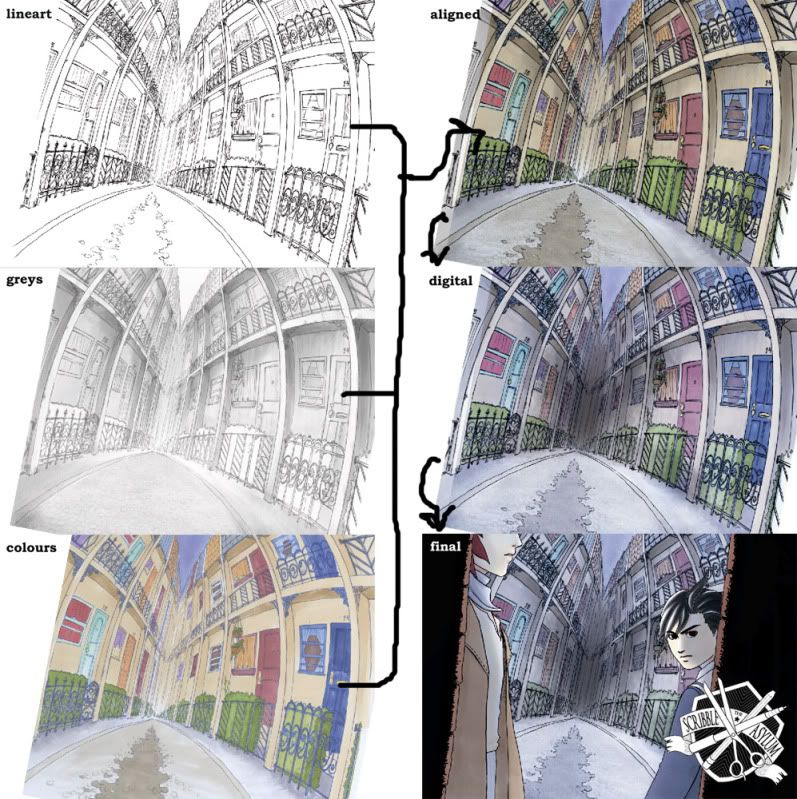
I probably spent a week, on and off, drawing it in pencil. I had never tried warped perspective on that kind of scale before and I was very happy when I finished inking it. (However, looking at it now means that I see lots of mistakes.) The Copic colour version was much too bright and cheerful (limited palette) and the shadows weren't striking enough, which is why I made a seperate shadow/grey image. For some reason, trying to align 3 images was a big pain! Once I managed this, I toned down the colours in photoshop and did some other hocus pocus.

Because of the complexity of the background, the figures and the background were drawn seperately. Once they were also scanned and altered, they were whacked in front of the background - there, finished!

Sunday, December 12, 2010

Building Sketch


Verric speaking here!

Evi and I are working hard! Architecture is one of my biggest weaknesses. So it is very important for me to work from references and to use proper perspective to help my buildings and settings look real. Here is an example from an upcoming chapter.

First, I drew it from the reference picture Evi found in a great architecture book. We did a few changes to make the building fit the aesthetic that we wanted, as well as extrapolate parts which we couldn't see.


And now I've started to pencil it into the panel. The perspective point vertically is off the top of the page, so I taped a piece of scrap paper to the drawing board above this sheet to sketch the perspective lines.


I'm happy with it so far, but there's still a lot of work to go!

Friday, December 3, 2010

Process of making "That's him!"


Verric speaking here!

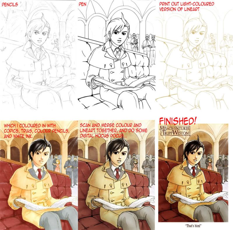
Here are the steps in making my picture "That's him!", which I will be releasing on my dA shortly.


Click to enlarge


I'm sure I have an unecessarily convoluted process, but here we go!

1. Draw and 2. Ink it. For this picture, it took longer than normal because originally I wanted to set it in a train station.

3. Scan it. Alter lineart as needed- e.g. cleaning stray lines. I have to smooth them out too, but that's to discuss another day. I make a colour copy of this lineart, and print it out.

4. Colour it in! As you can see, I have a very limited colour palette. For this picture, I used 15 different markers (Copics and Trias). The colours can often scan up differently, but I'm not too fussed, as I use this as a base for altering digitally. I also wanted tis picture to be a little textured so I used some colour pencils for detailing and shading. With white ink I put in highlights on the chair and the policemen's helmets. In this stage, because the lineart is so pale, the characters tend to look like they have eyes that stare into your soul. I coloured his eyes in just to prevent myself being scared ;)

5. I scanned the colours in and lined both of them up, with the lineart on top on multiply. It must be lined up perfectly. Thats why the lineart of the colour is printed pale, in case I get it wrong. (Also, it prevents it being too noticable if the copic makes the printer ink bleed - which it shouldn't do. However, I've been using very cheap printer inks lately and there's slight bleeding.)

6. Digital hocus pocus time! I put some stone texture for the background, which made it a bit grittier. I put some leather for the seat, which I'm not very happy with. Darker shadows and highlights are brushed in. As you can see, the colours have changed a bit, as I had trouble deciding how saturated I wanted it. Lastly, I slap on the logo and slip in the text at the bottom.

So that is how I make a colour picture. Sometimes backgrounds and different figures are drawn seperately, depending on what is needed. A background is drawn seperately if it has lots of colours, detail or very likely to bleed.

Thanks for reading!